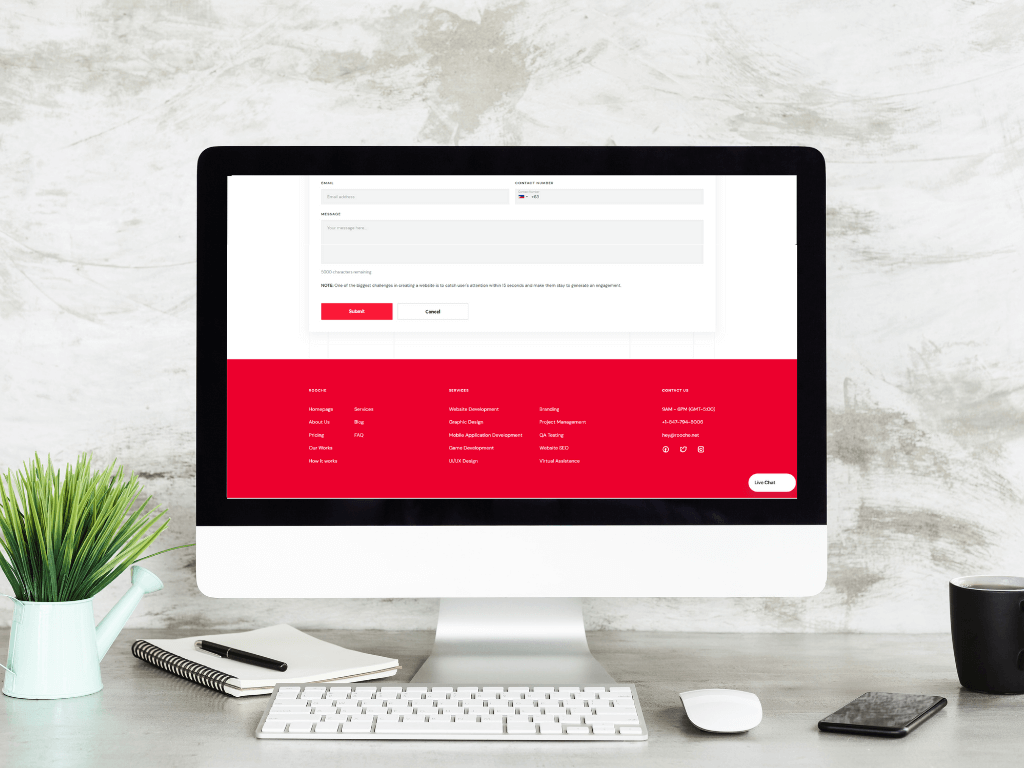
An Overview of Four Essential Website Footer Elements
Your website’s footer seems to be the spot where all your site’s information gets dumped—from the company info page to […]
Dec 8, 2022
Dec 8, 2022

As a web designer, it is important to stay current with the latest trends. This not only helps you create better websites but also helps you market your services more effectively. After all, potential clients want to know that you are up-to-date and understand the latest trends. So, what are the latest web design trends?

One of the biggest trends in web design right now is flat design. Flat design is a minimalist approach that uses clean lines and simple elements. This trend started gaining popularity in 2012 with the release of Windows 8 and has continued to gain momentum since then. Flat design is popular for a number of reasons.
First, it is very user-friendly. When users are presented with a flat design, they know exactly what to do. This is because there are no distractions and the path to conversion is very clear. Secondly, flat design is very versatile. It can be used for any type of website, from a simple blog to a complex eCommerce site. Finally, flat design is easy to implement and can be done quickly and cheaply. If you are thinking about using flat design for your next project, here are a few tips: Start by using a simple color palette. Flat design relies heavily on colors, so it is important to choose a limited number of colors that work well together. Use clean fonts that are easy to read. And, finally, use plenty of whitespace to give your design a clean and modern look.
Another popular web design trend is Material Design. Material Design is a Google-created design language that combines the best of flat design with additional 3D elements. This creates a more realistic and tactile feel that is perfect for websites that want to convey a sense of physicality, such as eCommerce sites.
If you decide to use Material Design for your website, there are a few things to keep in mind. First, use colors sparingly. Too many colors can make your site look busy and overwhelming. Stick to a limited color palette and use bold colors sparingly. Secondly, use shadows and depth to create a sense of realism. This will help your users understand how they can interact with your site. And finally, use animation sparingly. Too much animation can be distracting and makes it difficult for users to focus on the content of your site.
Another big trend in web design is minimalism. Minimalist websites are clean, simple, and easy to navigate. They are focused on delivering the user experience and conversion, without any distractions. If you want to create a minimalist website, there are a few things to keep in mind. First, use a limited color palette.
Stick to two or three colors that work well together. Secondly, use whitespace to your advantage. Create plenty of negative space to give your users a break from all the content. And finally, use clean fonts that are easy to read.
These are just a few of the latest hot trends in web design. As you can see, there is a lot of variety in the types of designs that are popular right now.

While complex typography can be used to create beautiful websites, it is important to use it sparingly. Too much complexity can make your site difficult to navigate and can be overwhelming for users. If you do decide to use complex typography, here are a few tips: Use a limited number of fonts. Stick to two or three at most. Use plenty of whitespaces to break up the text and make it easier to read. And finally, use simple, clean fonts that are easy to read.
While Javascript can be used to create interactive and engaging websites, it is important to use it sparingly. Too much Javascript can make your site slow and difficult to use. If you do decide to use Javascript, here are a few tips: Use a simple design that is easy to navigate. Stick to a limited number of colors. Use plenty of whitespaces to give your users a break from all the content. And finally, use clean fonts that are easy to read.
A front-page slider is a great way to showcase your best content, but it is important to use it sparingly. Too much content in the slider can make your site look busy and overwhelming. If you do decide to use a front page slider, here are a few tips: Use a limited number of slides. Stick to three or four at most.
In conclusion, there are many hot trends in web design. However, it is important to use these trends sparingly. Too much of any one trend can make your site difficult to use and can be overwhelming for users. Stick to a simple design that is easy to navigate and use plenty of whitespace to give your users a break from all the content. And finally, use clean fonts that are easy to read. Thanks for reading!

Your website’s footer seems to be the spot where all your site’s information gets dumped—from the company info page to […]
Dec 8, 2022

Your website is the digital home for your business, and it’s a great tool to generate leads. It can be […]
Jan 11, 2023

The Cargus Mobile App gained popularity over the App Marketplace with over 300,000 downloads. Furthermore the mobile app monthly sales […]
Dec 8, 2022
Join our newsletter and be the first to receive future promo and sale updates from Rooche!