
What are the Key Elements that Contribute to a Successful Brand?
Well, it’s a question that comes up all the time. And it’s a question that’s worth asking because there are […]
Dec 8, 2022
Each year, a new set of web design trends emerge as designers across the globe attempt to push the boundaries of what is possible on a website. As we all know, the internet is constantly evolving so it’s essential to be aware of the latest trends. This is important if you want your website to stay relevant and thrive in the future. One such trend sweeping the web design industry right now is responsive website design.
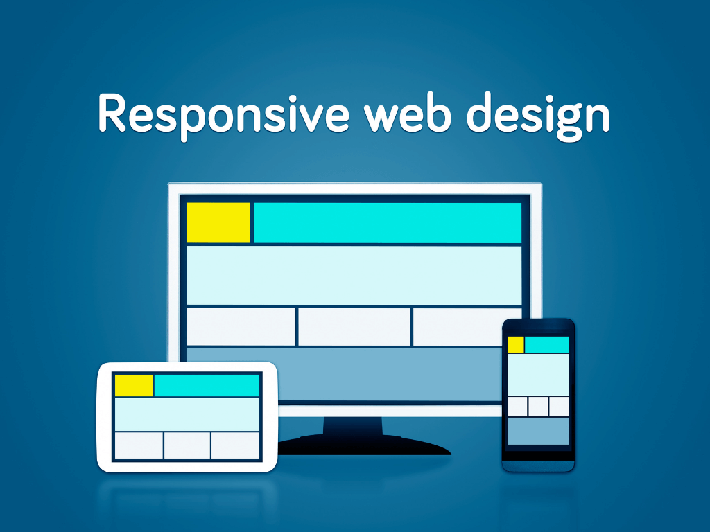
Responsive web design (RWD) is a method of designing websites to display nicely on different devices and screen sizes. It’s a web design approach that ensures that visitors have a good visual experience regardless of the device they’re using. Furthermore, a responsive web design automatically resizes itself based upon the screen size of the device displayed. In simpler terms, a responsive web design will adapt its layout to fit whatever device it’s being viewed on. Whether you are viewing it from a desktop computer monitor to a smartphone.
As our world gets faster and more interconnected, it becomes increasingly important to connect with your customers wherever they are, as quickly and efficiently as possible. To do this, you need to pay attention to what you are showing them visually. You have to think out of your own box. Think as if you are the visitor. You need to point out some necessary errors and improvements to make sure that you are giving them the best user experience as much as possible.
Also, responsive web design makes your site look great on any device or screen size, whether it’s a laptop or a phone. It is essential for growing your business because it helps you get found on search engines like Google. As I said earlier, it is a crucial part of creating an excellent customer experience. Because responsive websites are built from the ground up with mobile devices in mind, they load quickly and offer better navigation than traditional websites do on phones. That means that all those people who run searches for local businesses or products will have an easier time finding yours—and then coming back again and again!
Web design is changing. If you’re not already designing responsive websites, you should be.
With mobile internet usage growing at an unprecedented rate, responsive web design can help you build a better experience for your audience.
Here are four advantages and why your web design should go responsive:
Making your site responsive is pretty simple. First, you should make sure all your images, videos, and other media are responsive. This means that they automatically adjust to the size of the screen in which they’re being viewed. This has been done for you if you’ve used [responsive site builder]!
Next, it’s essential to think about how your site is displayed on a mobile device. Things like dropdown menus and expandable sections might be great ways to organize content on a desktop screen, but they don’t always translate well to mobile devices.
Finally, if you’re manually coding your website or using [non-responsive site builder], it’s important to use media queries. This lets you write CSS rules that apply only when certain conditions (such as screen size or device type) have been met.
It’s not just a fad, and it’s not just a trend. Responsive web design is here to stay, and it should be an essential part of your modern website.
The internet is no longer just for your desktop computer or even your laptop. It’s for tablets, phones, and the millions of people who use those devices to access the web every day. That’s why responsive web design is one of the most important aspects of a modern website.
So if you haven’t made your website responsive yet, or don’t know how to begin, give us a call. We are happy to talk with you about how you can make your website into an attractive, eye-catching experience for all your visitors.

Well, it’s a question that comes up all the time. And it’s a question that’s worth asking because there are […]
Dec 8, 2022

If you’re new to developing for Android, then you’ve probably noticed that there are many different ways to create a […]
Dec 8, 2022

The software development cycle is the process that software developers use to create, test and deploy new software applications. It […]
Dec 8, 2022
Join our newsletter and be the first to receive future promo and sale updates from Rooche!