In May 2022, TeraBox received recognition as a Silver Winner for Best New Mobile App
Cloud storage provider TeraBox won the Best New Mobile App Silver Award from Best Mobile App Awards in the categories […]
Dec 8, 2022
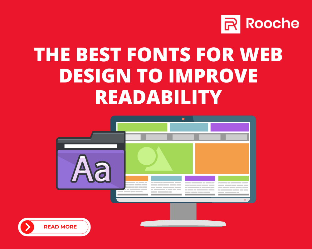
When it comes to visual communication, you want to make sure that your audience can read your content easily. If your text is too small or too difficult to distinguish from the background, then your audience won’t be able to read it. They’ll feel frustrated and annoyed by having to squint at tiny words or go in and out of focus on your graphic elements, which will make them less likely to engage with the content and take away from its effectiveness.
Designers have to make sure that their audience can easily read the text in their graphic design. To accomplish this, they need to use easy-to-read fonts. That’s why we’ve compiled a list of the best fonts for web design!
A font is a style of writing or printing characters in a particular typeface. There are thousands of fonts for web design available on the Internet, and many of them are free to download and use. Fonts come in all shapes and sizes, but some are better than others at making your content easy to read. For example, you might use a sans serif font like Arial or Verdana because they’re easier to read than serif fonts like Times New Roman or Courier New.
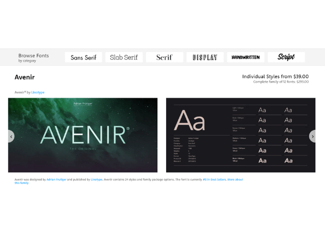
If you’re looking for a font that’s bold, beautiful, and versatile, Avenir is a perfect choice. It was designed for legibility, with a large x-height, long ascenders, compressed proportions, and open forms to increase the space between letters.
You can’t go wrong with a classic. Arial is a font that looks great in any medium, from print to the web, and it’s super versatile. Arial has become so popular because it’s clean and legible—even at small sizes—and because it has a wide variety of weights. It also has many different styles that mimic the styles of other fonts, such as Helvetica or Times New Roman.
The Futura font was designed by Paul Renner in 1927 and has been used in many logos and branding campaigns. The font is considered a geometric sans-serif typeface, meaning that the letterforms are based on geometric shapes, rather than being based on calligraphic forms.
Helvetica Neue is a font that is frequently used in the design industry. This font is known for its readability, and it’s often used on websites and other platforms to ensure that the text is easy to read. Helvetica Neue can be found on many different devices and applications, including MacOS and Microsoft Word.
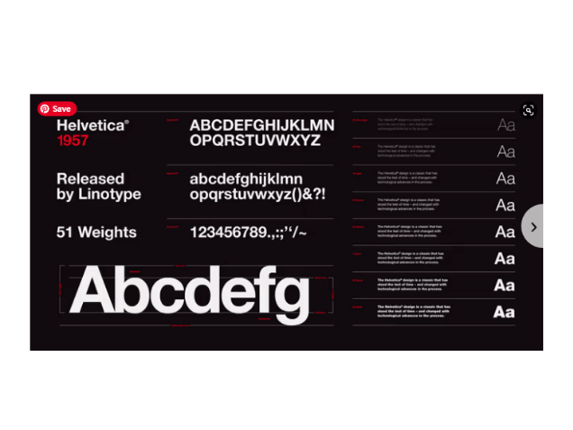
Helvetica font is a good font to improve readability. It has a “neutral” design and can be used in any context. The letterforms are very similar to each other, so they can be easily distinguished from one another. Helvetica is also a very legible font, which means that it’s easy to read.
As such, it is the most well-known and recognized serif font for use on the internet. The Georgia font is also a good choice for your website because it has good legibility and contrast, which improves readability.
It is a sans-serif font that comes with a bold, light, italic and regular version. The Open Sans font has a simple look which makes it easy to read on the web. It has rounded corners which make it look friendly and approachable. The font also has rounded edges which help improve readability by making the letters less angular than other fonts like Arial or Helvetica Neue.”
Roboto Slab has wide letterforms and a large x-height—that is, it has tall lowercase letters and short ascenders and descenders. This makes the font easy to read at a distance, which is important on the web when you don’t want to distract users from your content by making it hard to read.
Merriweather Sans Condensed font has large spacing between letters and words, so it’s great for people with dyslexia and other vision problems. The letterforms are also very clear, so it’s easy to read quickly.
Lato font has a large x-height, which means that the lowercase letters are taller than the uppercase letters. This makes it easier for your eyes to find the next line of text and makes reading more comfortable.
Takeaway:
There is no one-size-fits-all font. Each font has its own personality and they each serve its own purpose. It’s a common misconception that there is a single, perfect font for every situation. In reality, each font has its own personality and they each serve its own purpose.
Cloud storage provider TeraBox won the Best New Mobile App Silver Award from Best Mobile App Awards in the categories […]
Dec 8, 2022

Web Design Backgrounds Backgrounds are an essential design element, but many people overlook them. When designing a website, most people’s […]
Dec 8, 2022

Today, mobile apps are everywhere. With the development of Android, iOS, and Windows Mobile Operating Systems, there has been a […]
Dec 8, 2022
Join our newsletter and be the first to receive future promo and sale updates from Rooche!