Excellent Benefits of Having A Business Mobile App
There is so much room for success when talking about mobile app development. When you think about creating one for […]
Dec 8, 2022
Backgrounds are an essential design element, but many people overlook them. When designing a website, most people’s first instinct is to get started with the layout, but a good background can provide the structure to support your form and make it look more polished.
Imagine for a moment that you’re putting together an outfit. You have the cutest top, but it just looks off if you pair it with a bad skirt. And if you match it with the perfect skirt, you suddenly have something unique on your hands. The same goes for website backgrounds: A bad background can diminish even the most beautiful design while a good one can take it to the next level.
The best background for your web design depends on the site’s content. You might want a background that makes your clothing stand out if you’re selling clothes, like a white background. If you’re selling a product related to nature, maybe you want an image of nature in the web design background. If you want something that’s not distracting, perhaps a solid color would be best. Always note that the background should work with your content, not against it.
Different Types of Commonly Used Web Design Background Style
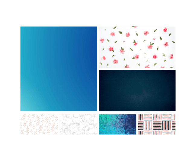
White
This is the default background color for most websites and is the most common. Many people prefer this type of background because it is easy on the eyes, and it is easy to read text on top of a white background.
Patterns
Patterns add texture to geometric or organic images (i.e., nature-inspired). There are many ways available, from polka dots to stripes, and even ones inspired by retro fashion trends like paisley prints and floral designs. Patterns can make an image look more feminine or masculine depending on the type of pattern used. For example, geometric patterns tend to be more masculine, while floral designs tend toward femininity.
Gradient
Gradients are significant if you want to add a pop of color and transition into another color. They are typically used to make your image look more 3D and increase the depth of field. You can use gradients in two different ways: one-tone or two-tone. One-tone angles are when you have one solid color that transitions into white. Two-tone gradients are when you have two different solid colors that transition into each other.
Solid Color Web design backgrounds
To make a solid color background, choose a color on the color wheel and then use that color as the background for your website. You can also choose from a wide variety of pre-made colors from the “Color Picker” tab on your screen.
Choosing the right one can make even the simplest responsive web designs look polished and professional. The background you pick has the power to communicate a mood, convey information, and direct your viewer’s attention to different areas of your design.
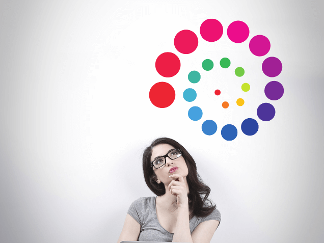
It does matter! Color can affect how your audience experiences your website. Green, for example, is associated with natural things like plants and growth, whereas orange is associated with warmth, like the sun and fire. If you are a landscaping company, you’d want to use green to coincide with what you do. If you have a fireplace installation business, you’d like to use orange to go along with what you do.
Patterns are another part of your website that people may not think about when considering their overall design aesthetic. But just like color, patterns can affect how people perceive your site and how much information they subconsciously pick up from it.
Ideally, the colors you choose for the background will compliment your selected colors for the rest of your site. If you’re unsure how to do this, try looking at some color charts online. You can also use a tool made for web designers that allows you to upload images and test different colors on them.
Since most people navigate websites using mobile devices these days, it’s essential to make sure that your images are responsive and will look good on all kinds of screens. Make sure the file isn’t too big and has a high enough resolution—if you’re using an image with low resolution, it can become pixelated when viewed on a mobile device.
Lastly, think about how the background will work with other elements on your site. It should contrast nicely with your text, images, navigation bars, and other visuals so that everything comes together well.
There are many factors to consider when choosing a suitable web design background for your website. Most important is how it will make people feel when they see it. You want to use a background that conveys the right mood and tone while maintaining legibility and readability.
The choice is up to you! But you should seriously consider some of the above options and how they might affect your website’s users and overall look.

There is so much room for success when talking about mobile app development. When you think about creating one for […]
Dec 8, 2022

Discover the profound impact of UX design on London websites. Learn how a well-crafted user experience can enhance your website’s performance.
Aug 1, 2023
Have you ever used a website on your phone, only to have to scroll horizontally to see everything? Or maybe […]
Dec 8, 2022
Join our newsletter and be the first to receive future promo and sale updates from Rooche!