
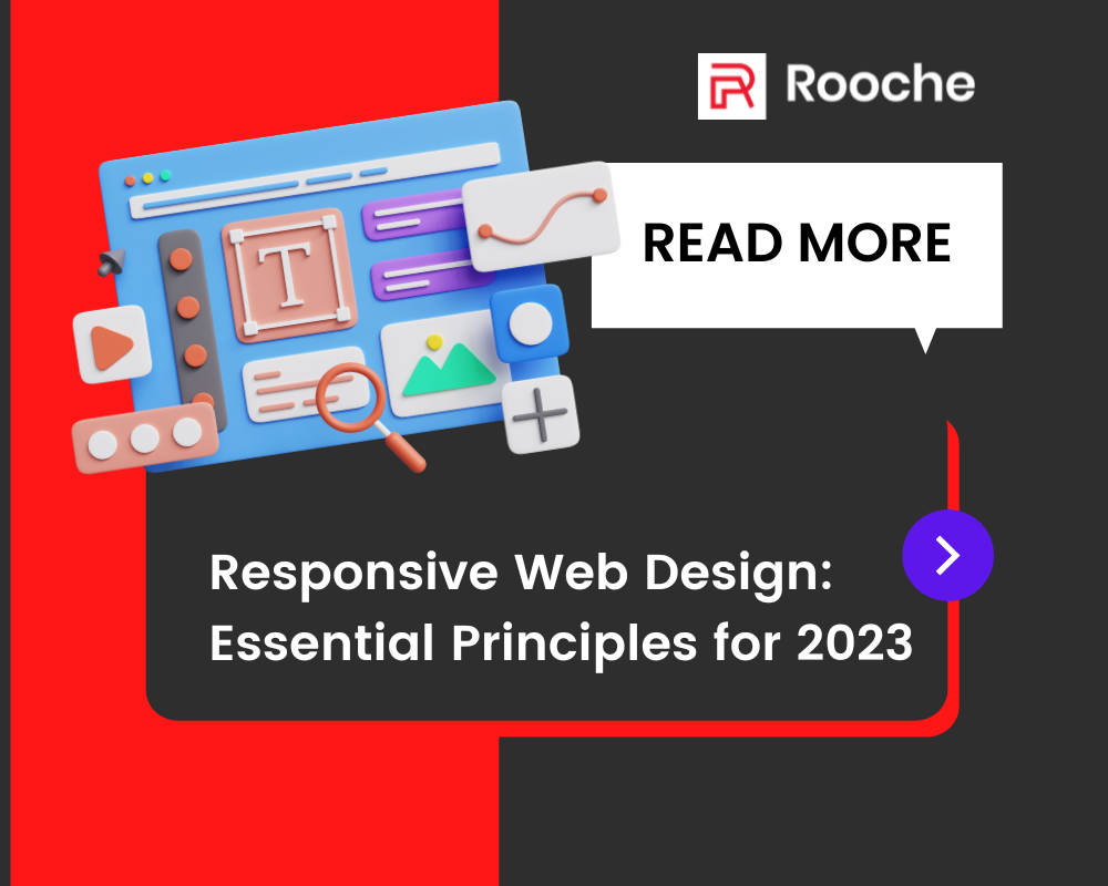
Web Design Trends: What is Hot and What is Not!
As a web designer, it is important to stay current with the latest trends. This not only helps you create […]
Dec 8, 2022
The web development world is constantly evolving, and website owners must stay up-to-date with the latest trends. In 2023, responsive web design will be more important than ever before. For website owners who want to stay ahead of the curve, understanding the essential principles of responsive web design is key.
Responsive web design (RWD) is an approach to web design that allows a website to respond and adjust itself to different screen sizes, devices, and orientations. It ensures that the website remains optimized for the device it is being viewed on, making it easier for users to access content quickly and efficiently. By using RWD, websites can provide a better user experience by automatically adjusting the layout of content so that it’s easily readable across multiple devices.

RWD also helps improve search engine optimization (SEO) by providing a consistent experience across devices. By making sure all versions of a website have the same content and structure, search engines can more effectively crawl and index them.
This leads to improved visibility in search engine results pages (SERPs). Additionally, since RWD requires fewer redirects from mobile versions of sites, page loading times are improved on mobile devices. With faster loading times, users are more likely to remain on your site longer which in turn leads to higher conversion rates.
Responsive web design has many benefits for businesses in 2023. It allows them to have a website that is optimized for different devices and platforms, which can improve the user experience and engagement. Visitors will be able to access and interact with the same content on their laptop, tablet, or mobile device. Here are three key advantages of responsive web design:
These advantages make responsive web design an essential part of any business’ digital strategy in 2023. It will ensure that the website is accessible across all platforms and devices, providing users with an optimal experience regardless of what device they’re using.
Responsive web design requires a special set of elements to ensure the website is optimized for all devices. These elements can be broken down into content, layout, navigation, and media queries. Content is the most important element of a responsive website as it should be designed with a mobile-first approach. This means that content should be structured for both large and small screens, so that users receive the same experience regardless of device size.

Layout is the next element when it comes to responsive web design. The layout should be designed to respond to different screen sizes by using a grid or flexible layouts that adjust according to the device size. Navigation plays an important role in ensuring users can move through your site easily on any device. Navigation menus should be collapsible and have dropdown menus for easy visibility on smaller screens. Finally, media queries are needed to adjust images and other media types so they display correctly on different devices and screen sizes.
By utilizing these four elements within a responsive website design, websites will remain accessible and look great no matter what device is being used in 2023 and beyond.
Breakpoints and media queries are essential components of responsive web design. They enable developers to create a website that can adapt to any device, regardless of size or orientation. A breakpoint isn’t just a point at which the design responds differently, it’s also a point where the developer can make changes to the code behind the design.
Breakpoints are based on the width of the viewport, allowing developers to adjust a layout when a certain threshold is reached. Media queries allow developers to target specific devices in order to provide optimal viewing experiences for each type of device.
It’s important to establish breakpoints and use media queries properly in order for a website to be truly responsive. Developers must take into consideration both device sizes and orientations when deciding where and how breakpoints should be set up.
Furthermore, they must also consider user preferences like font size, as well as overall context such as page structure and content hierarchy. By following best practices and keeping up with technology trends, websites will remain fully optimized for every user across all devices in 2023 and beyond.
After setting up breakpoints and media queries, testing and optimization is the next step in creating a successful responsive design. Testing involves making sure that the design works on all devices, browsers, and operating systems that users might be using. It’s important to test early and often so that any bugs or issues can be identified and fixed quickly. Optimization focuses on making sure the website loads quickly, looks great on all devices, and requires minimal scrolling or zooming from the user.
Here are three key components to keep in mind when testing and optimizing a website:
Testing and optimization should be an ongoing process throughout the entire development cycle. This will ensure a smoother user experience by ensuring that the website is working as expected across various devices. Additionally, it will make it easier to identify any potential problems before they become major issues.
Frameworks are an important part of responsive web design. They provide a structured base for creating sites that look great across all devices. There are several frameworks available, each with its own strengths and weaknesses. Popular frameworks include Bootstrap, Foundation, and Bulma.
Bootstrap is a popular open-source framework that provides an easy way to create responsive designs. It includes a wide range of components and plugins, making it easy to customize designs quickly. Foundation is another popular framework that provides powerful tools for creating mobile-first sites. Lastly, Bulma is a modern CSS framework that makes it easy to add custom styles and animations without coding from scratch.
It’s important to select the right framework for your project needs when building a responsive website. Each one has its pros and cons, so do plenty of research before deciding on one. With the right framework in hand, you can ensure your website looks great no matter what device it’s viewed on.
As the world of web design continues to evolve, so do the trends for responsive web design. As technology advances, so must design practices and tools. In this section, we will explore some of the most exciting future trends in responsive web design:
Design Trends
Development Trends:
Testing Trends
With these new tools and trends, designers can continue to deliver websites that provide an optimal user experience no matter what device they’re using or which platform they’re on. This ensures that the content is accessible regardless of where it’s viewed from, providing users with a seamless experience every time they visit a website.
In conclusion, responsive web design is essential for any modern website. It allows us to create a site that works across all devices and provides the best possible user experience. The key elements to consider when designing a responsive site include breaking points, media queries, testing and optimization, and frameworks. With these tips in mind, we can ensure our website looks great no matter what device our users are viewing it on.
Looking ahead to 2023, we can expect the trend of mobile-first design principles to continue. Responsive web design will remain an essential part of creating a successful online presence. Not only will responsiveness be a priority, but also the speed of websites will become even more important as users demand faster loading times.
Overall, responsive web design is something that every website should incorporate into their development process if they want to stay competitive in the ever-changing digital landscape. Taking the time to learn these essential principles now will help you create better websites in the future and keep up with the latest trends in web design.

As a web designer, it is important to stay current with the latest trends. This not only helps you create […]
Dec 8, 2022

A lot has changed since the first websites were built. In the early days, these sites were simple, but they […]
Dec 8, 2022

It’s no secret that owning a multi-service app like Gojek is becoming increasingly popular. With its awesome services and customer-centric […]
May 29, 2023
Join our newsletter and be the first to receive future promo and sale updates from Rooche!