

Why Businesses Choose Custom Web Mobile App Development
Mobile app development has become a necessary investment for businesses across various industries. It helps them tap into new markets. […]
Dec 8, 2022
Many companies struggle to create new business ideas that encourage conversions and generate sales. A website is one of their best options to aim their goals to grow their sales and reach a wider audience. Your business needs to be consistent in checking your website’s performance, and visuals are something that you don’t want to take for granted.
Usually, we meet some of the common mistakes that a website usually encounters. Identifying and rectifying these errors before launching your website is a must. The mistakes were subtle, though they caused severe damage. They frighten consumers, introduce unnecessary difficulties, and overwhelm visitors.
On some web pages, spelling errors are the ones that we notice the most. Maybe someone didn’t check the spellings because they rushed to create the site. Although typos are a bit blunder, for some people who are obsessive about every detail, they are generally enough to turn them off. Before you place the content on the pages, you must check and perform some tests on some grammatical tools that you can use.
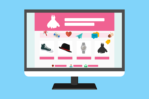
Graphics and images help to make our website more appealing to the eye. It usually catches the attention of our visitors, mainly if it provides a good picture. When we come across an image that isn’t related to the topic, try to avoid it. If you can’t find any stock photos relevant to your content, it’s best to leave it blank than to upload irrelevant images. It makes no logic and will appear awkward. Consider this: you’re addressing website development and inserting a random photo of the ocean. Although the image is appealing to the eye, it is incomprehensible.
What you give must be emphasized in your content. It’s challenging to develop content because you can’t just pick a topic to post on your website at random. Remember, your site is your live sales representative, so think before clicking on anything. Every piece of content relating to your products and services must be addressed. Although it may be tempting to discuss something currently trending if it isn’t relevant to your niche, why would you publish it there? Even for the sake of engagement, your website should only offer information that is pertinent to your business.
Every company has its own set of branding materials. It’s the typefaces and colors that your business utilizes to distinguish itself. Your company needs to build a brand because it sets them apart from competitors. It is a visual representation of your business; everything you post and develop must be based on your brand kit. Even if it’s appealing to use on your layouts, avoid employing odd hues and tones. This is the most typical mistake made by certain businesses, who select a random template and fail to integrate their website with their brand.
Many people use their mobile phones to access the internet. You should take this seriously because you will be using your website to target these potential clients. It’s not ideal if they land at your site, and it’s a jumble because the template is overlapping on their phone’s grid. Your marketing efforts will be completely ineffective. Before you publish your live site, you should test everything and verify it on your mobile phone.
These common mistakes can permanently be fixed and avoided. Just make sure that you pay attention to every detail. Check it twice before you publish your live site. It may be a small mistake, but it can give you a significant impact, whether it’s positive or negative.

Mobile app development has become a necessary investment for businesses across various industries. It helps them tap into new markets. […]
Dec 8, 2022

Each year, a new set of web design trends emerge as designers across the globe attempt to push the boundaries […]
Dec 8, 2022

If you’re running a business, there’s no doubt that your customers want to be able to do more with your […]
Dec 8, 2022
Join our newsletter and be the first to receive future promo and sale updates from Rooche!