
A Website To Aid in the Battle Against Monkeypox is Launched in Chicago
One software engineer, Micheal Cumming, 24 launched a website in Chicago. It is to improve the process of getting monkeypox […]
Dec 8, 2022
Color plays a very important role in the world of web design. But it’s not just about picking any pretty color. The colors you choose for your website can considerably impact user experience and overall usability—and that’s something worth considering before you pick your website’s color.
Color is a key component of your brand’s identity, and your website is your brand’s biggest showcase. Here are some questions to help you choose the right color for your website design:
Your brand should be reflected in everything from your color scheme to your copywriting style. You want to make sure the colors on your website reflect your brand identity. For example, if you’re a company that creates sustainable, eco-friendly products, you wouldn’t want to use a black background—instead, you’d like something lighter and more natural-looking. Think about what your brand stands for, and then think about which colors best represent those values.
Choosing the right color for your website is more than just selecting a color that looks “good” to you. The colors you desire make a statement about you, your business, and the message you want to send. Let’s take a quick look at some theories about color psychology:
Color is so much more than just aesthetics—it can also help attract customers and make them stay on your site longer. Color psychology is a real thing. And although there’s still a lot of debate on the topic, it’s generally agreed that color impacts our moods, emotions, and even our buying decisions (especially when it comes to websites). The point here is that there are a lot of considerations in choosing your website’s color palette. Just one of them should account for the psychology of color—and what it can mean for your business.
There’s nothing wrong with getting ideas from others, especially if what they’re doing is working! You can check the websites of businesses in your industry. You can also search for websites with the same product or service as you do. By searching, you will know what works and what does not work with their design and color scheme. Use these observations as a starting point, but don’t feel too constrained.
It’s tempting to use every color under the rainbow, but remember: less is more when color schemes. When choosing the right color for your website, keep one thing in mind: simplicity is key. You might be tempted to go with a splashy color scheme that pops and stands out from the crowd. But you have to remember that your website is there to serve the needs of your customers—not the other way around. If a visitor to your site gets overwhelmed by your color scheme, they’ll probably leave without further exploring.
You can pick the right color scheme that works well onscreen and experiment with different background textures. Doing this will give you a solid foundation for building the web design’s look and feel. here are some popular color schemes that have proven successful for many website users:
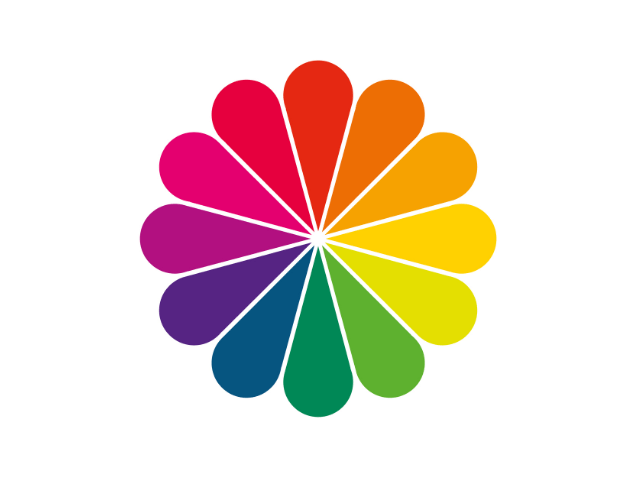
Complementary: These colors are two colors that sit directly across on the color wheel. They are often used in web design because they contrast nicely and look good together. When using complementary colors on your website, you will have one dominant color, which will be your site’s background or primary features. You can then add small pops of the second color on various pages. This creates a very clean and simple look that is user-friendly and professional.
Monochromatic: This means using just one color—usually a darker shade—and using different tints and shades of that one color. This is often used for very image- or video-heavy; for example, a photography portfolio or video blog might use this scheme so that the site doesn’t take away from the images themselves.
Analogous: This means picking three colors that are next to each other on the color wheel (like green, blue-green, and blue) and using these colors in different shades throughout your site.
Before you decide on a final color scheme, it’s important to test it out with real users to see if there are any issues or ways it could be improved.
Picking the right color for your website can be extremely important because it will affect how people see your website. The color can either give a welcoming feel to people or turn them off. If you have the right color and feel to your website, people will want to spend more time on your site. There are many different websites, but you have to find the one that best works for you. If you do this, you will be able to pick the right color for your website!
Picking the right color for your website can be extremely important because it will affect how people see your website. The color can either give a welcoming feel to people or turn them off. If you have the right color and feel to your website, people will want to spend more time on your site. There are many different websites, but you have to find the one that best works for you. If you do this, you will be able to pick the right color for your website!

One software engineer, Micheal Cumming, 24 launched a website in Chicago. It is to improve the process of getting monkeypox […]
Dec 8, 2022

Understanding what SEO Keywords is? Keywords are the words or terms that people type into search engines to find information […]
Dec 8, 2022

As a business owner or investor, it is important to have a clear understanding of financial markets and the factors […]
Mar 16, 2023
Join our newsletter and be the first to receive future promo and sale updates from Rooche!