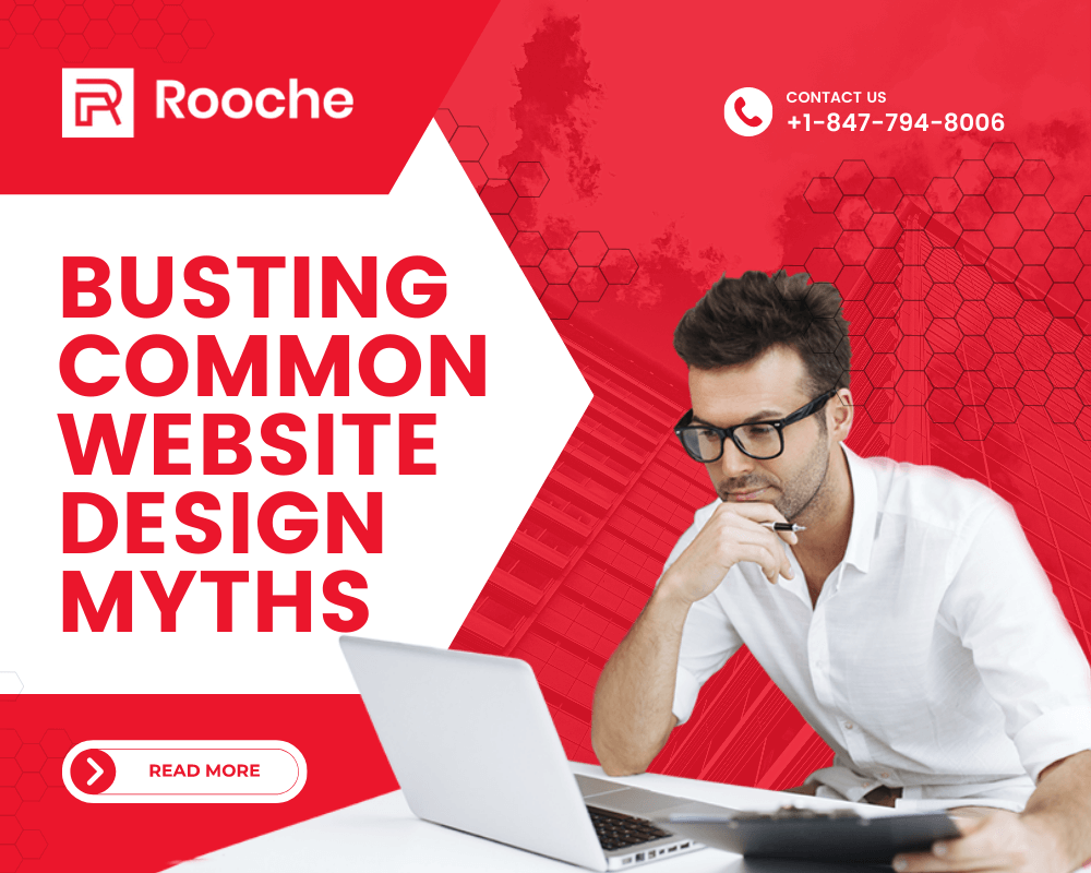
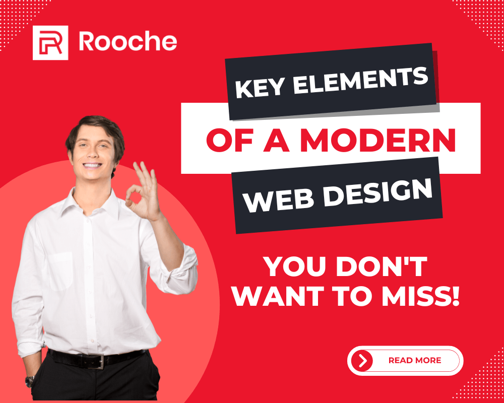
Key Elements of a Modern Web design You Don’t Want To Miss!
The web has been through a lot of changes over the years. What was a new frontier in the online […]
Dec 8, 2022
Building a website for your business is not just about creating a beautiful, functional design—it’s about crafting an experience. Whether you’re a small business or a large corporation, your website should reflect the vision and personality of your company. That’s why the websites you should build are designed with your audience in mind, and built to be both functional and beautiful.
Your website is more than just a pretty face; it’s the foundation of your brand. When you work with Rooche, you get a website as unique as you are, and one that’s guaranteed to make a lasting impression on your customers.
Furthermore, website design is a complicated field, with a lot of differing opinions and considerations. So it’s no surprise that there are a lot of myths out there about what makes a website “good” and “bad.”
Let’s take a look at some of the most common website design myths and bust them wide open!
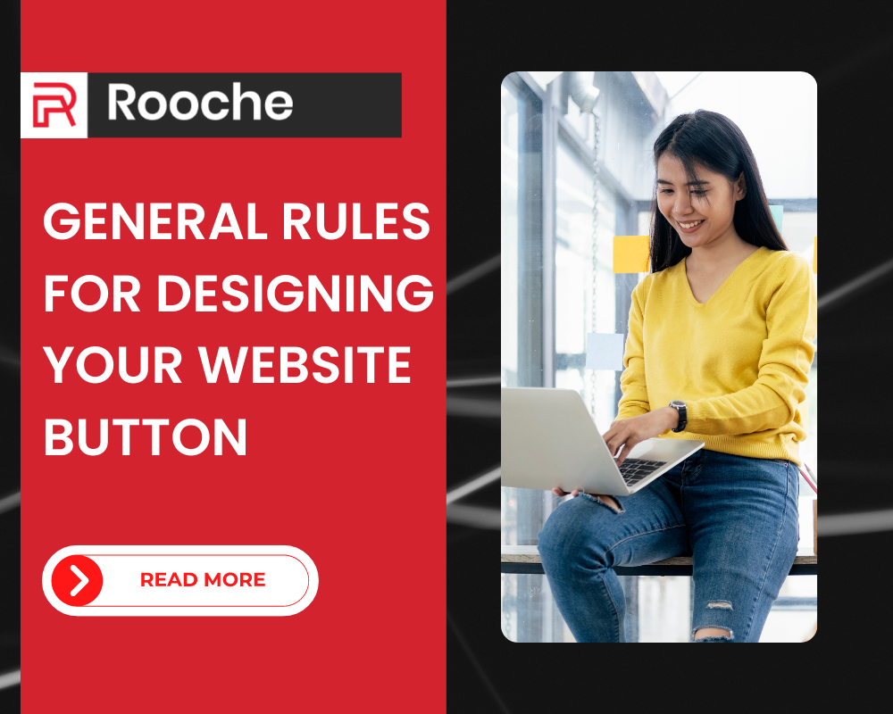
This is a myth that we hear all the time. But in reality, you don’t need a lot of colors to make a website look good—you just need the right ones.
This is why we recommend using no more than three colors. Think about it: how many colors do you really want your website to have? How many colors can your eyes take before they start feeling sore and tired?
Some people think that having a whole rainbow of colors on their website will make it more interesting, or show that they’re fun and creative. But unless you were selling crayons, it’s actually going to have the opposite effect: It’s going to make your site look cluttered, messy, and disorganized.
Now, don’t get me wrong—color is important. Color can set the mood and tone of your site; it can help communicate what kind of business you are; and it can help you attract your ideal audience. But just like with anything else in life, excess does not equal success in the case of color.
So use color wisely! Pick one main color for your main button or call-to-action, and then maybe 1 or 2 others that complement that main color
One of the biggest myths about web design when it comes to content is that you need a lot of text on your page. This is true for some kinds of websites, but not for others. In fact, most businesses don’t need much text on their sites at all. A few paragraphs will do the trick in most cases, and even a single paragraph can be enough to get the point across.
When your website’s primary goal is to generate leads or sales, there’s no reason to have paragraphs and paragraphs of text on every page. It won’t help you achieve your goal— Of course, this doesn’t mean you should forget about content altogether—you still need to make sure your site is readable and easy to navigate, with clear calls to action so visitors know what to do next. You just don’t need as much text as you think.
Another myth is that your font size needs to be large enough for everyone to see. The truth is, the font size should be small enough to fit everything you want on the page. You want to make sure it’s easily readable—don’t forget that some people might have disabilities that impact their ability to read text—but don’t make it larger than it needs to be. This approach will help you fit as much information on the screen as possible, which means more opportunities for your users to see what you have to offer.
Adding more pages to your website makes sense on paper—the more pages you have, the more information about your business you can provide. But in reality, this approach is counterproductive. Longer websites can overwhelm users and make them less likely to spend time on your site.
Instead of adding more pages, consider how you can streamline existing web pages and make them easier for visitors to navigate.
Truth: Website design is definitely about aesthetics—it needs to look good! But looks aren’t everything. Your site also needs to function well (people don’t want to search for things—they need to find what they need quickly) and accurately reflect your brand (you wouldn’t wear sweatpants to a job interview).
Website design can be a mysterious art. When it’s done right, it feels like magic—like the website has always been there, and it was born out of your own brain. When it’s done wrong, though, it can feel like you’re wandering through a maze with no idea how to get out.
Before you start your next website project, make sure you know the difference between these four common myths about website design and the truths that will help you on your way to creating an amazing site for your business.
The web has been through a lot of changes over the years. What was a new frontier in the online […]
Dec 8, 2022
These days, almost every business has a website. If you’re running a business and don’t have a website, you’re missing […]
Dec 8, 2022

What is Ecommerce Web Design? Ecommerce web design is the art of designing and developing a website centered around being […]
Dec 8, 2022
Join our newsletter and be the first to receive future promo and sale updates from Rooche!