How Much Does A Website Redesign Cost in 2022
Website redesigns cost is not the same thing as updating UI/UX. A website redesign is a complete overhaul of your […]
Dec 8, 2022
May 9, 2023

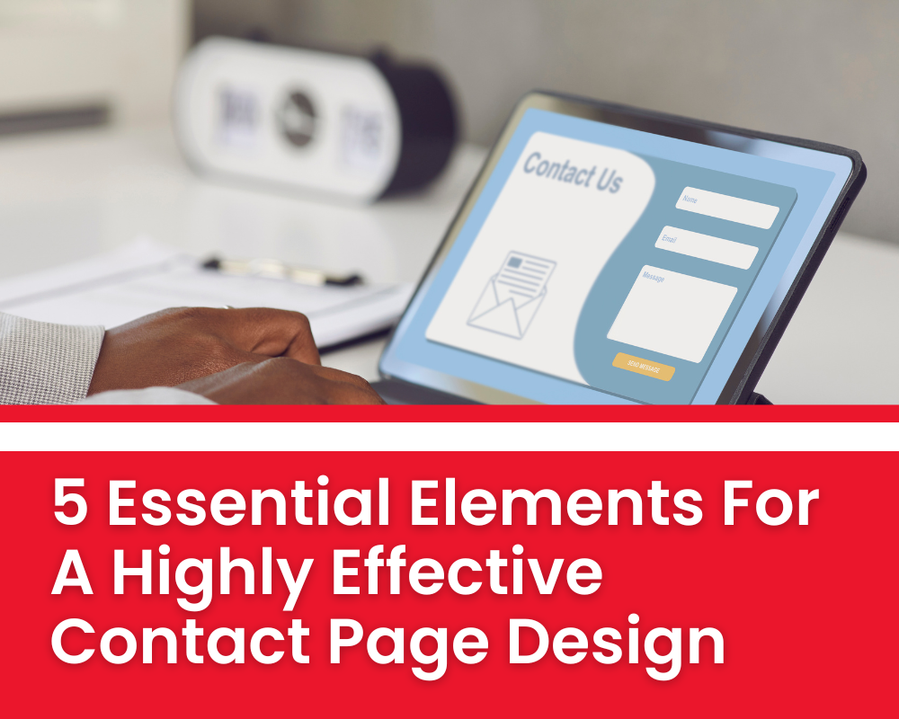
A great contact page design is essential for any modern website. It’s the place where customers and potential customers go to get in touch with a business, ask questions, and learn more about the company or service. Unfortunately, many websites don’t have contact pages that are effective or easy to use. That’s why we’re here to give you five essential elements for creating a highly effective contact page design.
A contact page is an essential element of a website. Its purpose is to provide visitors with a way to reach out to the company or individual behind the website. It should be easy to find, and it should contain all relevant contact information.
The contact page should include a visible link or button on the homepage that leads visitors directly to the contact page. The contact information should be clearly organized so that visitors can find what they need quickly and easily.
This could include phone numbers, email addresses, physical addresses, and other forms of communication such as social media links. Additionally, the contact page should also provide visitors with a way to submit inquiries using an online form. This will allow visitors to send their questions directly to the business or individual running the website.
When designing an effective contact page, layout and content considerations are essential. Both should be carefully considered to ensure that the message is conveyed in an appealing and organized way. The layout should be simple and uncluttered, with clearly labeled sections so visitors can quickly find what they’re looking for. It’s also important to include a call-to-action button or link that takes users directly to the contact form.

Additionally, consider using visuals to create a visually pleasing page design that will draw people in and encourage them to contact you. The content should be concise and easy to understand, with all necessary information included such as contact details or company address.
In addition, it’s important to make sure the tone of the content matches your brand personality and reinforces your message. A well-crafted contact page will ultimately help build trust between you and potential customers or clients. With these essential elements in place, you can create an effective contact page that encourages interaction from visitors.
When designing a contact page, accessibility and readability are essential. For example, the page should be optimized for mobile viewing, and text should be kept to a minimum. The page should also utilize a clear hierarchy of headings and subheadings to ensure that important information stands out.
The font size should be large enough for readers to easily read the content on the page, with plenty of white space between elements. Also, using colors judiciously can help draw attention to certain parts of the page.
All in all, if readers can find what they need quickly and without any hassle, then it is likely that their experience will be positive. To ensure this happens, designers must prioritize accessibility and readability when creating contact pages.
Having discussed the importance of accessibility and readability, let’s move on to visual design elements. One key element of a highly effective contact page design is color. The right colors can help create an atmosphere of trust and professionalism, while the wrong ones can make it difficult for visitors to take you seriously. When picking colors for your contact page, consider using shades that are calming or inviting. Using too many bright colors or clashing hues can be overwhelming and distracting.

Another important element is the use of imagery. Images can be used to create a feeling of connection between visitors and your brand, as well as draw attention to specific sections of the page. Consider including images that are relevant to your business or brand, such as a logo or signature image, which can give visitors a sense of familiarity and reliability.
Additionally, you should include visuals that illustrate the purpose of your contact page – for example, an image of people interacting with each other via a phone call or online chat could help emphasize that your business is available to answer questions quickly and easily.
Interactivity features are essential to a highly effective contact page design. It’s important to provide users with an easy way to reach out and get their questions answered quickly. A few interactive features that should be included in any contact page design are:
These features make it easy for visitors to connect with customer service or support teams, enabling them to get the help they need without having to search for it. By providing interactive elements, businesses can increase engagement and create a positive customer experience. Additionally, these elements can be used to capture leads and build relationships with customers.
Once interactivity features have been implemented, it is crucial to test and optimize a contact page design for the best user experience. All elements should be tested to make sure they are functioning properly, such as form fields that submit information accurately, links that lead users to the correct pages, and buttons that take them various places. Additionally, testing should also be done to verify that all interactive elements are mobile-friendly, since more than half of website traffic now comes from mobile devices.
All interactive features must also be optimized for performance. This means optimizing for speed, so the page loads quickly and doesn’t cause lag. Additionally, the layout should be optimized for usability. Visitors need to find what they are looking for easily and quickly – either by scrolling through the page or using navigation links – in order to ensure a positive user experience.
By testing and optimizing a contact page design, essential elements can come together cohesively to create an effective user experience.
In conclusion, creating an effective contact page requires careful consideration of the user experience. It’s important to have a layout and content that is easy to find and understand. Accessibility and readability should also be taken into account when designing the page.
Visual design elements should support the overall usability of the page, while interactive features such as forms or live chat can make it easier for visitors to get in touch with you. Last but not least, testing and optimization are key steps to ensure that your contact page is performing at its best. By following these essential elements, you will be able to create a highly effective contact page that meets the needs of your users.
I hope this article has given you some useful insights into how to design an effective contact page. With a little effort and attention to detail, you can create a great first impression for visitors who come looking for help from your business. Contact us today for more information!

Website redesigns cost is not the same thing as updating UI/UX. A website redesign is a complete overhaul of your […]
Dec 8, 2022

As a web designer, it is important to stay current with the latest trends. This not only helps you create […]
Dec 8, 2022

One software engineer, Micheal Cumming, 24 launched a website in Chicago. It is to improve the process of getting monkeypox […]
Dec 8, 2022
Join our newsletter and be the first to receive future promo and sale updates from Rooche!