The Role of Web Development in Telemedicine
In the age of COVID-19, telemedicine has become an invaluable tool. Not only can it provide medical services to those […]
Feb 11, 2023
Dec 8, 2022

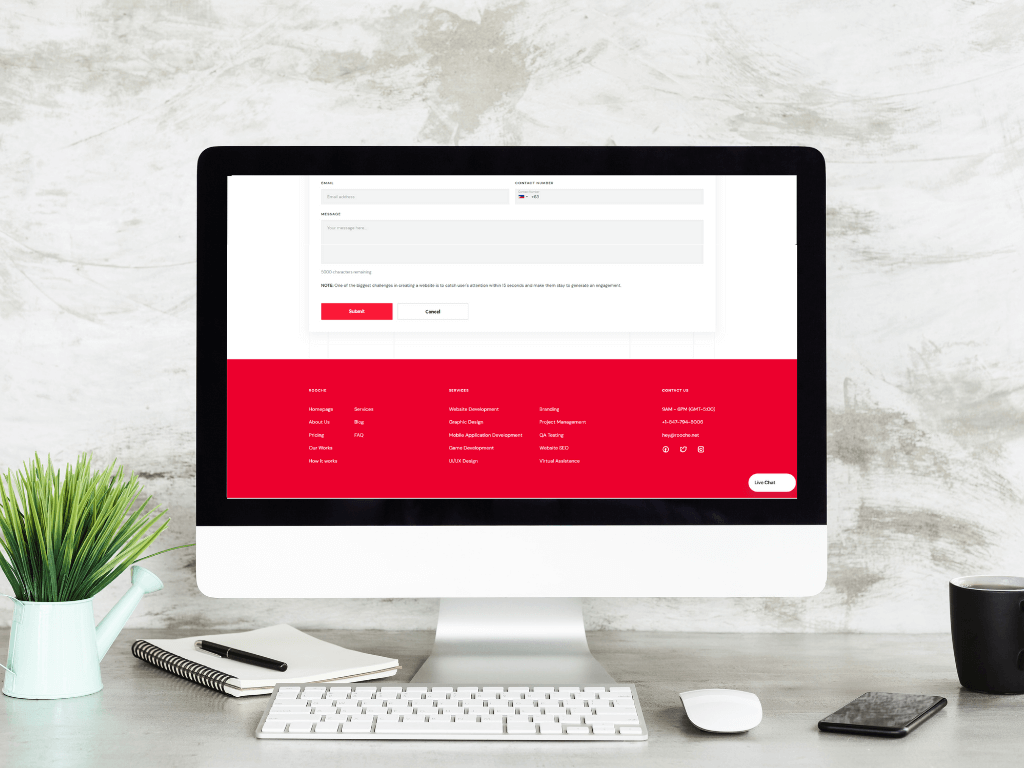
Your website’s footer seems to be the spot where all your site’s information gets dumped—from the company info page to the contact page to the privacy policy. We know that creating a straightforward, streamlined footer design can be daunting. That’s why we’re here to help!
While many people use footers as an opportunity to give their users valuable information, such as how users can contact them, many also use it to put their copyright information as part of their legal disclaimer. Doing so serves as a visible reminder to people that the work within your website is your intellectual property.
The footer is an excellent place to put it because it appears on every page. When doing so, you should also include the year when the work was first created, along with your company’s name.
Contact information is vital for any website, but it’s essential for the footer. We all know web design trends come and go, and it can be hard to keep up. However, one trend that has remained constant throughout the years is the importance of having contact information in the footer of your website.
This makes sense. If you’re trying to sell products or services online, your potential customers will want to know how to get in touch with you! Contact information can also include a link to your online store, a phone number for customer support, and any other social media links that apply to your business.
As long as you provide helpful information for your customers, there’s no absolute limit here. A good rule of thumb is to make sure that you have all the information that your customers need readily available from any single page on your site. It may seem like a small detail, but it can be incredibly frustrating if you have to search all over your website to find out how to buy something or contact you.
While not required by law, including a privacy policy link in your page footer is highly advisable. Website Terms and conditions, privacy policy, legal information—all of these are essential elements to consider when putting together a website’s footer. Terms and conditions pages seem simple on the surface: they’re the final, legal confirmation that you’re using a website. But there’s a lot of important information in those terms and conditions that can help you out in unexpected ways. Please take note that your website is one of the essential elements of your marketing and brand identity, and that’s why it’s so important to have clear, concise terms and conditions for your visitors. For your business, clearly-defined terms and conditions are an essential part of building trust with potential clients.
Social media is a powerful tool for spreading your brand’s message and building your audience, but it also serves another purpose: as a critical element in your website’s footer.
We all know about the “follow us” tabs on Twitter, Instagram, and Facebook on social media sites. But did you know that those icons are an essential part of your website’s design?
Social media icons are what many call “clickable logos,” meaning they serve as links to your brand’s social media pages. The “clickable logo” is a significant element of a modern website design because it provides the fastest way for your audience to connect with you online. This is the main reason why you need to put an icon to your website’s footer to make sure that once your users reach the end of the page, they might have an idea to see more about your company by clicking on the icons.
Social media icons are a great way to tie your website into the social media world. It keeps your customers engaged with your brand. Not only do they have promotional value, but a solid social media presence can also help you build a loyal customer base.
Now that you’ve learned these four vital aspects for your footer’s website, there is a common challenge that website owners frequently encounter.
A website footer is an essential piece of design—and often an overlooked one. Designing a footer is not always easy. There are numerous examples of unique footers out there. From the clean and modern to the quirky and fun, there’s a footer for every personality. And then there are those websites with such awful footer designs. This low-quality layout can make your users never want to revisit your site again. There’s so much more to designing a good footer than just throwing some legal mumbo-jumbo at the bottom. It has to be functional, too! If you want to create a good footer design for your website, book a call with us. We’ll help you make the correct dimensions for your custom footer design. We are there to help you get the right colors that fit with your overall website development.

In the age of COVID-19, telemedicine has become an invaluable tool. Not only can it provide medical services to those […]
Feb 11, 2023

A law firm’s online presence is a critical component of its success. With the growing number of users accessing websites […]
Aug 23, 2023

In a world where businesses are constantly vying for attention, it’s more important than ever to have a strong brand […]
Dec 8, 2022
Join our newsletter and be the first to receive future promo and sale updates from Rooche!