How Mobile App Can Elevate Your Online Class Sales
Mobile apps can be a powerful marketing tool to increase online class sales. By providing potential students with a convenient […]
Dec 8, 2022
Color plays an important role in web design. It’s not just about making a website look pretty – it can also affect user behavior and emotions. Color psychology is the study of how colors influence human behavior, and it can be applied to web design to create a more effective and engaging user experience. In this article, we’ll explore the role of color psychology in web design.
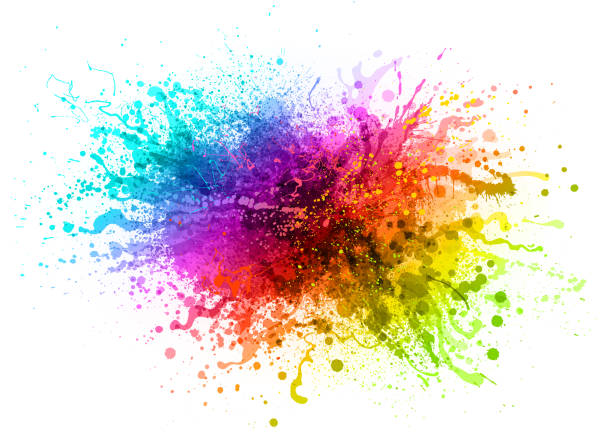
Color has the power to influence how visitors perceive a website, as well as their behavior on it.Studies have shown that certain colors can cause different reactions or behaviors from viewers. For example, blue has been associated with trustworthiness and reliability, while yellow is often seen as cheerful and inviting. Additionally, red has been linked to feelings of energy and excitement.
By using color strategically in web design, businesses can highlight important sections of their sites or direct users’ attention toward certain areas. For example, bright colors like orange or yellow can be used to draw attention to a call-to-action button or signup page; while softer shades like blues are generally better used for informative content where users may need more time to read through details. Additionally, contrasting colors can be used to make a page stand out more by creating visual hierarchy between the elements on the page.
The use of color also affects our emotions and moods when we look at a website. Depending on the combination of hues chosen for a site’s pages, visitors may feel calm and relaxed or energized and excited about what they find there. By understanding the effects of various color combinations in web design, businesses can create experiences tailored specifically for their target audiences — drawing them further into their story and making them more likely to engage with what’s being presented online.
Color psychology is the study of how different colors affect human behavior and emotions. It is the scientific understanding of how color impacts people’s moods, feelings, and behaviors. In web design, the use of color is essential as it can affect the way users perceive and interact with a website.
Different colors evoke different emotions in people. For example, red is associated with passion, energy, and excitement, while blue is associated with trust, loyalty, and calmness. Green is associated with growth, harmony, and balance, while yellow is associated with happiness, optimism, and warmth. Color can also evoke cultural and personal associations, so it’s important to consider the audience when choosing colors for a website.
Warm colors, such as red, orange, and yellow, are associated with passion, excitement, and urgency. They can be used to create a sense of energy and to draw attention to important elements on a website. Warm colors are often used in calls to action and to create a sense of urgency, such as in limited-time offers.
Cool colors, such as blue, green, and purple, are associated with calmness, serenity, and relaxation. They can be used to create a sense of tranquility and to establish trust and credibility. Cool colors are often used in websites that aim to create a sense of relaxation, such as health and wellness websites.
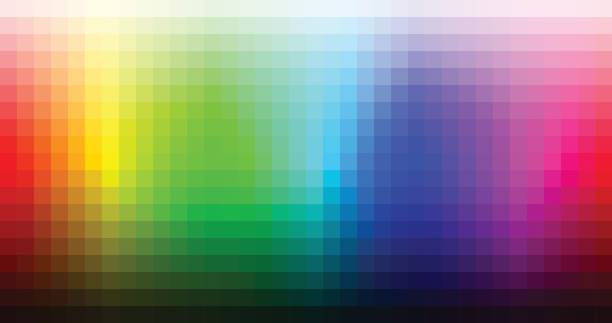
Creating a cohesive color scheme is important in web design as it can help establish brand identity and create a more visually appealing user experience. A color scheme is a collection of colors that are used throughout a website, including the primary, secondary, and accent colors.
Primary colors are the main colors used in a website’s design. They typically reflect the brand’s identity and are used to create a sense of consistency throughout the website. Primary colors should be chosen based on the brand’s personality, target audience, and the emotions the website aims to evoke.

Secondary colors are used to complement the primary colors and add depth and dimension to the website’s design. They are often used to create visual interest and can be chosen based on the primary colors, the brand’s identity, and the target audience.
Accent colors are used to draw attention to specific elements on the website, such as calls to action or important information. They can also be used to create a sense of hierarchy and guide the user’s attention. Accent colors should contrast with the primary and secondary colors to create a sense of visual interest and draw attention to the important elements.
It’s also important to consider the accessibility of the color scheme. For example, using high-contrast colors can make it easier for users with color blindness to navigate the website. It’s also important to avoid using color as the only means of conveying information, as this can make the website difficult to use for users with color blindness.
In web design, color can be used to evoke emotions and create a specific mood or atmosphere. By understanding how different colors are associated with different emotions, web designers can create a more effective and engaging user experience.
Contrast is an important aspect of color in web design. Contrast is the difference between two colors, and it can be used to create visual interest and guide the user’s attention. Contrast can also be used to improve the accessibility of a website, making it easier for users with color blindness to navigate and understand.
One way to use contrast in web design is by using high-contrast colors for important elements, such as calls to action or important information. High-contrast colors are colors that are very different from each other, such as black and white or red and green. By using high-contrast colors for important elements, web designers can make them stand out and draw the user’s attention.
Another way to use contrast in web design is by using complementary colors. Complementary colors are colors that are opposite each other on the color wheel, such as red and green or blue and orange. By using complementary colors, web designers can create a sense of visual interest and balance in the website’s design.
However, it’s important to use contrast carefully and with consideration for accessibility. Using low-contrast colors, such as light grey text on a white background, can make the website difficult to read for users with low vision or color blindness. It’s important to ensure that the contrast between text and background colors meets accessibility standards to ensure that the website is usable for all users.
In conclusion, color psychology plays an important role in web design. By understanding how different colors are associated with different emotions, web designers can create a more effective and engaging user experience. By using color and contrast effectively, web designers can create a website that is not only aesthetically pleasing but also effective in achieving its goals.

Mobile apps can be a powerful marketing tool to increase online class sales. By providing potential students with a convenient […]
Dec 8, 2022

A Website for your business is a powerful tool that can help businesses to achieve their goals. It is important […]
Dec 8, 2022

Color plays a very important role in the world of web design. But it’s not just about picking any pretty […]
Dec 8, 2022
Join our newsletter and be the first to receive future promo and sale updates from Rooche!