The Benefits of Having a Custom Website 2023
In today’s digital age, having a strong online presence is essential for any business or individual. One of the most […]
Jul 20, 2023
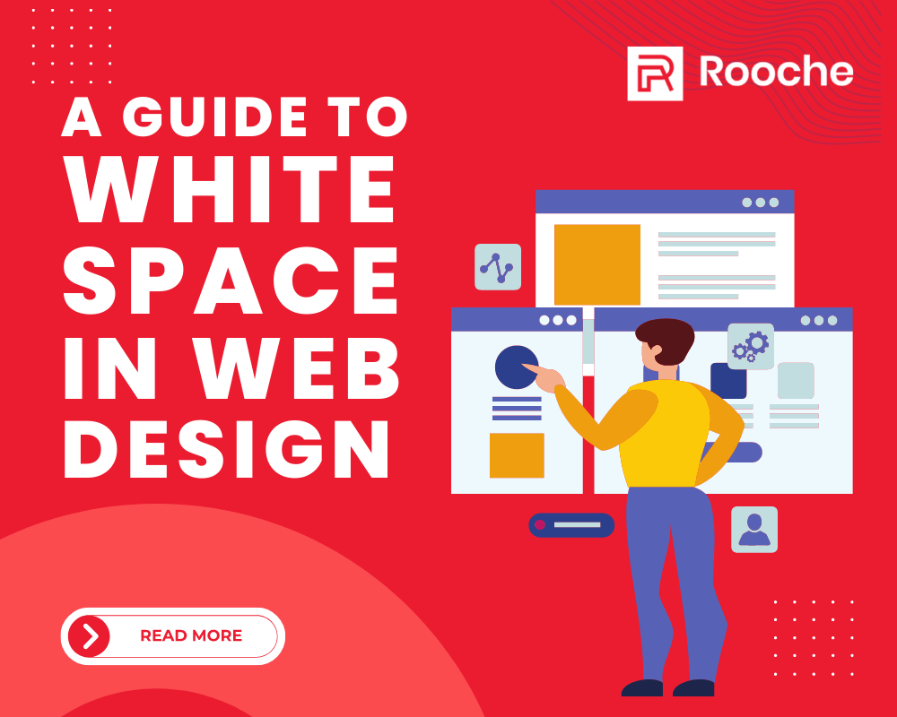
The term “white space” refers to any blank area on the page—it doesn’t necessarily have to be white (and it can even be an image). The idea of using white space behind is that sometimes less is more. By leaving some space around different elements on your webpage (whether they’re text blocks or images), you allow your users’ eyes the opportunity to rest rather than bouncing back and forth across the page. This increases readability and makes it more likely that people will stay on your site longer and find what they’re looking for sooner.
White space is a huge part of the design. You don’t have to look any further than the term ‘white space’ to know it’s essential: white is the most prominent, boldest color you can have.
Even so, it’s a common mistake to assume that white space is simply there to provide contrast between other objects. In reality, it’s an integral and crucial part of the design. In web design, using white space in your visual components makes a huge difference in how people perceive your site and even how they experience it.
This article will cover the basics of white space in web design and why you should be using it (or more of it) in your projects.

You need to know that white space—also called negative space—is your best friend. It’s a simple concept, but it can be hard to imagine that everything you don’t put on the screen is just as necessary as your stuff. It’s all about creating balance, so white space is so important in web design. It helps create balance visually, making your site look more professional and appealing to viewers’ eyes. But how do you use white space effectively? After all, there are many different ways you can use space on a website, from text margins to padding around images. Let’s discuss further how to use the white space in your web design project.
Before you start building a site, you need to understand what kind of content it will contain: lots of text? Lots of photos? Or maybe both? If there are many text or images on your website, you’ll want to use white space generously. You won’t need as much white space if you’re making a landing page with only a few paragraphs of text and one image.
It might seem counterintuitive to think about how you want your viewer to feel while looking at your website. After all, they’re there to buy products. Or learn something? Why should you care whether they feel comfortable?
Because how a viewer feels while looking at your webpage affects how likely they are to convert. If they don’t like what you’ve got going on, or if it makes them uncomfortable, they’re probably going to leave and find something else to do. So using white space properly is one way to improve.
Do you need to understand what kind of content it will contain: lots of text? Lots of photos? Or maybe both? If there are many text or images on your website, you’ll want to use white space generously. You won’t need as much white space if you’re making a landing page with only a few paragraphs of text and one image.
The general rule is that your site should balance text, images, and white space. There isn’t an exact percentage of your page that should be white space, but the more content you have—whether text or images—the more you’ll want. This is because if a page has too many elements packed together, it can appear cluttered and overwhelming. On the other hand, if there’s not enough content, your carrier may feel empty and unfinished.
To achieve valuable white space on your site, keep it simple! Use fewer images. You can also use short snippets of text on each page instead of long paragraphs. Remind yourself that it is okay to use fewer colors and elements. Your site will be easier to navigate and understand, AND it will look great!
Next, you consider balance. You don’t want too much or too little white space on your page—the key is finding a balance between large and small areas so that your content feels cohesive and balanced. Finally, you consider scale. You want the size of the white spaces on your page to match the size of the elements.
There are some simple ways to use white space to improve your designs. First, use white space to break up your text into different sections. This will help readers understand your message more efficiently and make the page easier to skim through for people who don’t want to read every word of your website.
Another great way to utilize white space is by putting it between elements such as paragraphs, lists, or images. This will give them visual separation, so they don’t blend and make it harder for readers to see where one element ends, and another begins.
White space can also be used to create hierarchy within a design. By using larger whitespace areas around certain elements like headlines or buttons, they’ll stand out more prominently than other items on the page, which might not get as much attention if there was no whitespace around them!
Finally, try incorporating negative space into your designs to make them feel more balanced and symmetrical without adding unnecessary clutter.
We hope that we have given you the essential tools to start incorporating white space in your design. Whether you’re creating a website for your business, adding some blank space can go a long way in making your procedure look clean and professional. Remember that there is no right or wrong way to use white space —as long as it works for what you’re trying to accomplish. Get creative!
In today’s digital age, having a strong online presence is essential for any business or individual. One of the most […]
Jul 20, 2023

Front-end frameworks have come a long way since their inception. From the early days of jQuery to the more modern […]
May 19, 2023

The world of web development is ever-evolving. Every year, new trends arise that make it necessary for developers to stay […]
May 12, 2023
Join our newsletter and be the first to receive future promo and sale updates from Rooche!