In May 2022, TeraBox received recognition as a Silver Winner for Best New Mobile App
Cloud storage provider TeraBox won the Best New Mobile App Silver Award from Best Mobile App Awards in the categories […]
Dec 8, 2022
Dec 8, 2022

The holidays are in full swing and it’s getting harder and harder to ignore the season of giving. This is excellent news for anyone looking to generate new leads and increase sales. If you are running a business, you are probably looking to make the most of the holiday season.
Your business can benefit from a targeted holiday landing page, just like millions of others worldwide. Whether you’re selling e-books, digitally gifting business cards, or marketing a physical product online, there’s great demand for holiday sales during this time of year.
A landing page focused on a specific item, such as a gift basket, can help draw customers’ attention and encourage them to buy. Whether you have a large or small business, checking out these landing page ideas will surely get your customers excited and ready to purchase from you.
Landing pages are a great way to get visitors interested in your product or service. They’re usually designed to catch the attention of people who are browsing online for products and services, especially those that are related to your business. If you’re not familiar with what a landing page is, it’s really easy to understand.
A landing page is essentially a website that shows up in search results when people search for a certain topic related to what you do. For example, if you sell laptops and you want more people to know about your laptop deals, you might create a page just for that purpose. It easy for people to find what they’re looking for. This means designing your site so it’s easy to navigate, with clear calls-to-action that help users find what they want.
You might not be able to give away free gifts, but you can certainly throw a party and make sure your site looks amazing while doing it. We’ve seen websites where all the colors come together perfectly and everything just feels fun—and even better, those sites tend not only to get more traffic but also better conversions from visitors who end up buying something from them (and thus making money).
Here are some ideas that will help you do this without putting too much effort on your part.
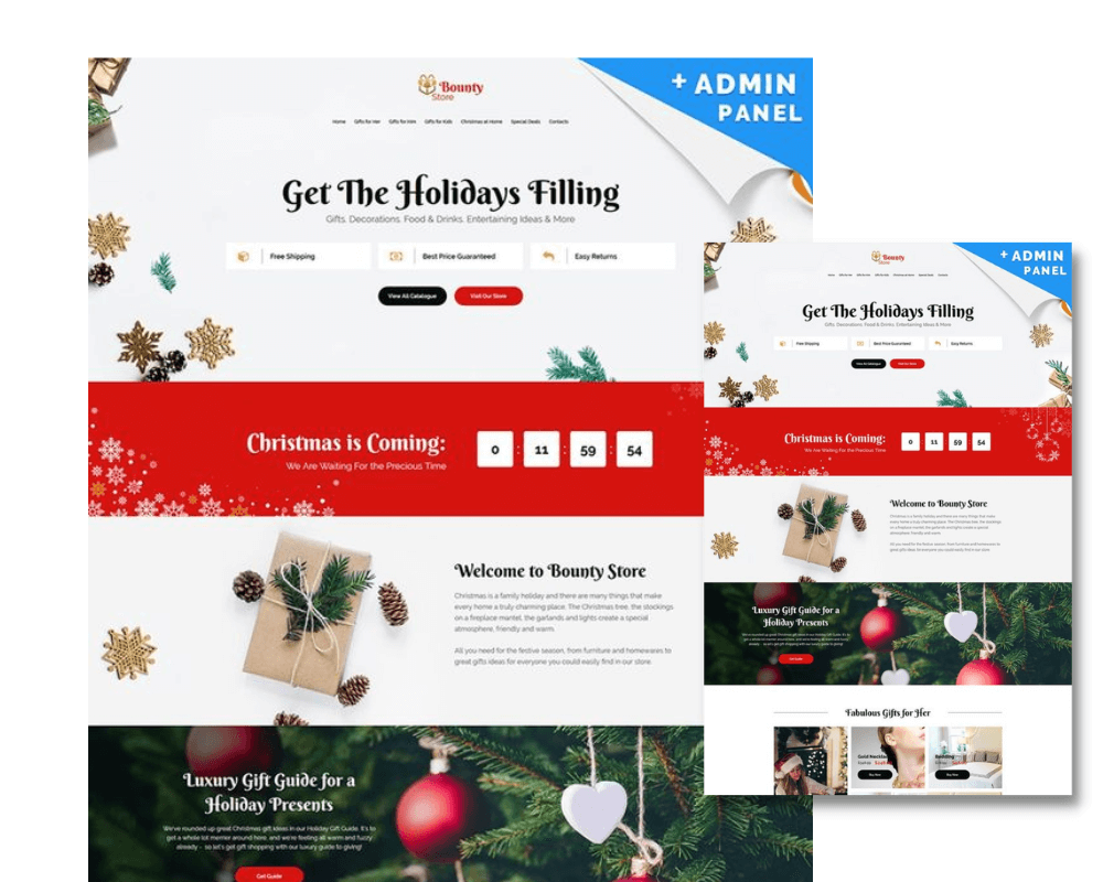
The holiday season is a great time to implement creative landing page design that incorporates festive colors and elements. Holiday color schemes create an atmosphere of celebration and can be used to set the tone for your marketing message. Utilizing bright, cheerful colors like red, green, gold, and silver will capture attention right away, while more subdued hues like blue and purple can be used to add depth and texture. Incorporating elements like snowflakes, gift boxes, pine trees, and snowmen are also a great way to evoke a sense of cheer and holiday spirit.
When creating a landing page specifically for the holidays it is important to think about how the use of color plays into the overall design. An effective color strategy may include contrasting or complementary colors that draw attention to key areas of the page or even gradients for a more dynamic look. Additionally, consider including some subtle textured patterns such as snowflakes or stars in order to further enhance the feeling of festivity. In general though it is unlikely that you’ll want too many elements competing for attention on your landing page so make sure to choose only one or two pieces of imagery that speak directly to your message.
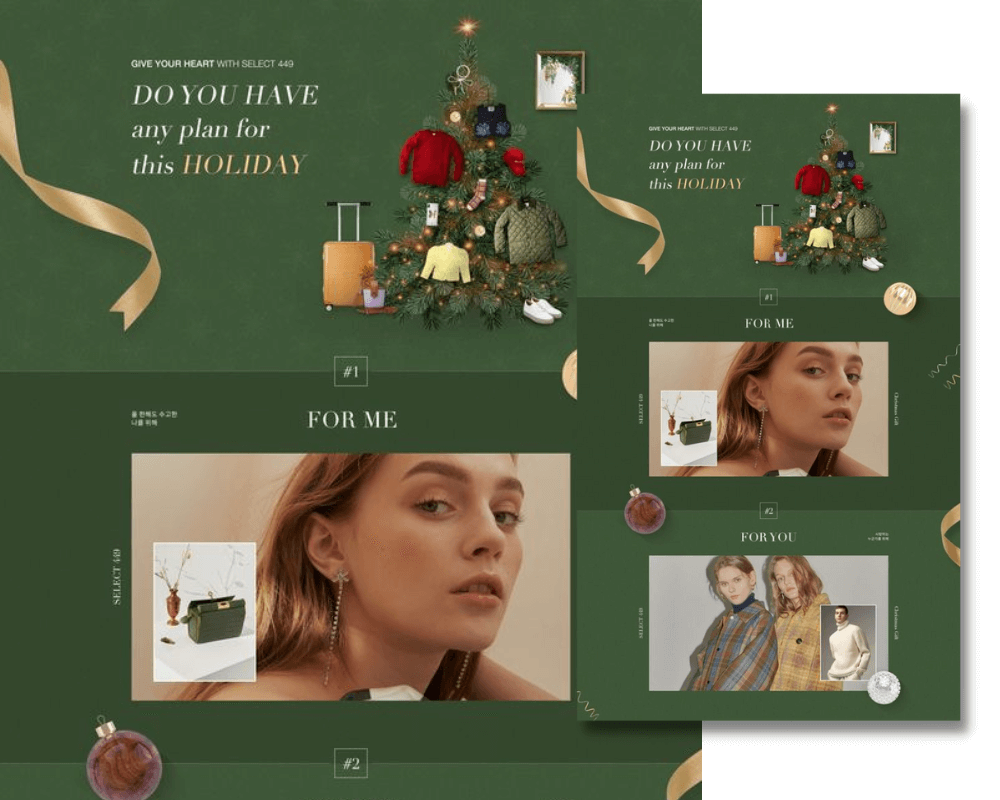
In contrast to icons, colors, and caricatures, users relate to real people. These things can certainly draw attention to a visitor’s feelings and actions, but for the best results, your landing page should also contain actual pictures.
The impact of real (mostly human) photos on landing pages and whether or not they increase conversions have been the subject of extensive research. Find a way to use actual photographs of your employees, clients, or even your products when designing your holiday marketing campaigns so that potential customers can easily match the website experience to their actual expectations.
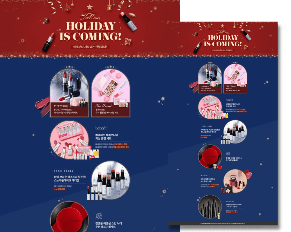
Another way to create an attractive holiday landing page is by utilizing visuals such as product photos, videos, animations, and even gifs. Showcasing the features of each product in detail will help customers make an informed decision about what they’re buying. You can also create interactive content such as quizzes that let shoppers select products based on their interests and preferences.
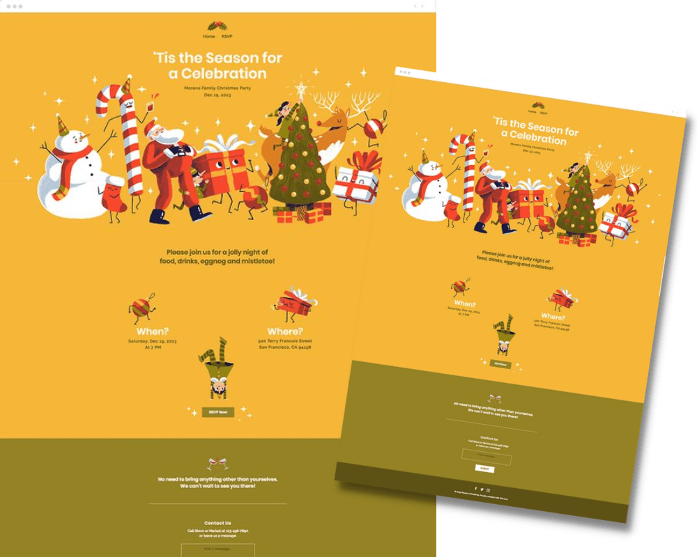
The psychology of familiarity has a much greater impact on our behavior from a social perspective. It explains why we are drawn to well-known figures like Santa Claus, the Easter Bunny, or even famous people. Whether it is justified or not, our trust in brands and products is based on how comfortable we are with them.
This idea of familiarity goes beyond simply trust-based judgment. For instance, we are much more likely to pay attention to something we are familiar with than something we have never seen before. As we observe our surroundings, our mind can only process a finite number of objects, colors, or figures. Naturally, we gravitate toward the things that support our convictions and validate our worldview.
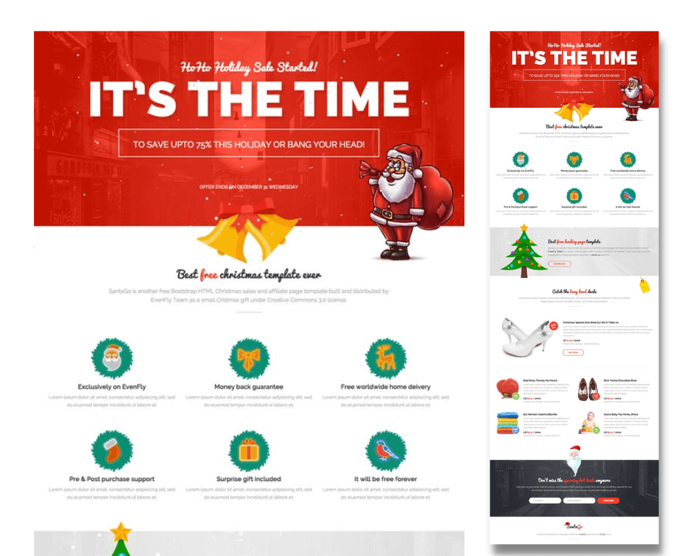
There are other visual cues and tactics that will have a similar effect as the colors you use to highlight certain elements of your landing page.
Marketers, for example, frequently use text-based visual triggers to capture your attention. This could be as simple as capitalizing a phrase, underlining text, or bolding a keyword. What is even more effective is the use of differentiating fonts. By using a simple font for the majority of the text on your landing page, you can use a more elaborate font to highlight important words and phrases.
The holiday season is a time for many things: family, friends, food, and business. The busy nature of this time of year can sometimes be overwhelming for small businesses that need to stay on top of their marketing and sales. It is to ensure they are meeting their market goals.
Businesses depend on their client’s ability to understand and buy into the brand. This is done through marketing strategies and products that are unique, relevant, and valuable. To increase sales during the holiday season, businesses can change the theme of their website and landing page to reflect a popular holiday or time of year.
Changing up your theme or color scheme will help you stand out from other businesses in the same industry and make it more appealing to potential clients. It also allows you to make sure that visitors are able to find what they’re looking for quickly and easily when they visit your site for the first time.
Level up your landing page this holiday season and get ahead of the competition! Take advantage of the season’s shopping fervor and skyrocket your online sales. With a free consultation from us, you can discover how to maximize the creative power of your holiday theme landing page.
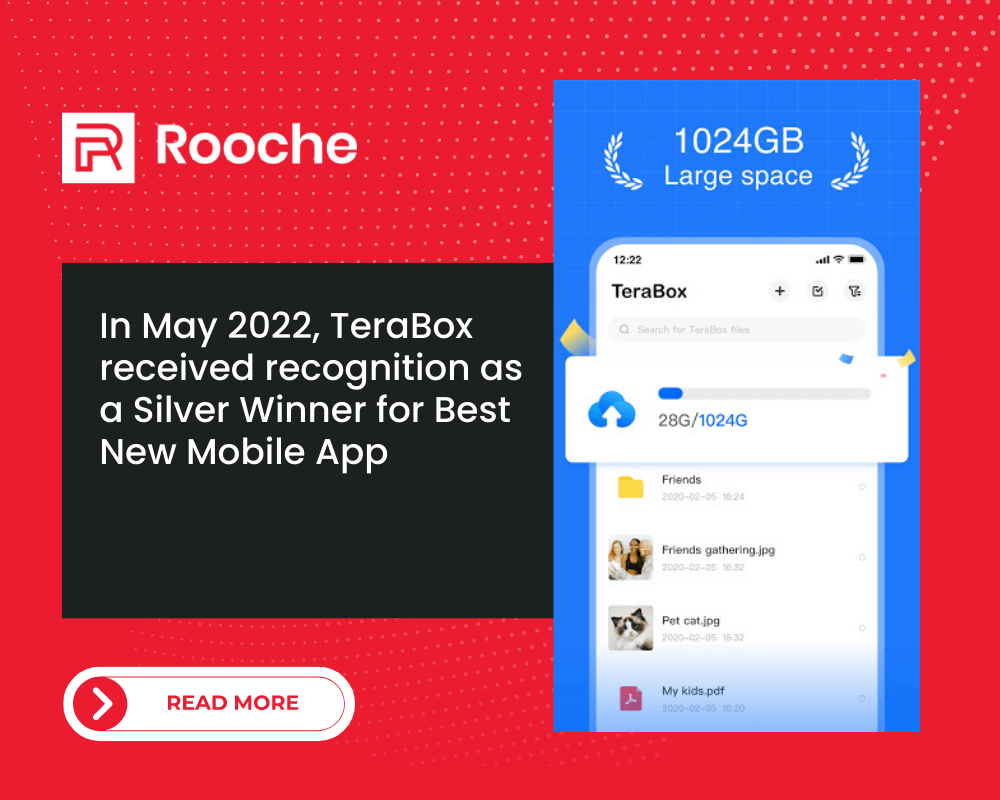
Cloud storage provider TeraBox won the Best New Mobile App Silver Award from Best Mobile App Awards in the categories […]
Dec 8, 2022

Page Transition Web Design is a style of design that introduces new styles and ideas. It maintains the original aesthetic […]
Dec 8, 2022

Understanding the Role of Front-End Web Developers Most web developers specialize in either the front end or back end of […]
Dec 8, 2022
Join our newsletter and be the first to receive future promo and sale updates from Rooche!