Endless Benefits Of Owning Multi-Services App Like Gojek for your Business
It’s no secret that owning a multi-service app like Gojek is becoming increasingly popular. With its awesome services and customer-centric […]
May 29, 2023
Dec 8, 2022

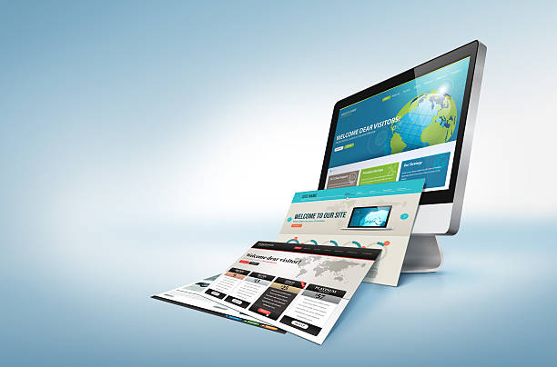
As someone who cares deeply about how a website looks and feels, it pained me to see common homepage design mistakes being made time and again. I want to share with you the most important elements that should be on your website’s homepage, as well as the things that absolutely shouldn’t. But first of all, what is the purpose of a homepage?
Your website’s homepage is like your shop window. It needs to give visitors an instant impression of what you do, and more importantly, it needs to make them want to find out more. It should be well-designed and uncluttered, easy to navigate, and above all else – it should be engaging.

As a web designer or developer, it’s important to understand the principles of designing an effective homepage. This includes understanding what should and shouldn’t be included on the homepage of your website. Personally, I like to see homepage that is simple which makes it easy for someone to understand.
Moving forward, the first thing you need to do is understand the purpose of your website’s homepage. Is it to sell products or services? Is it to provide information? Once you know the purpose of your website, you can start to design your homepage accordingly.
Some things that should be included on your website’s homepage include the following elements.

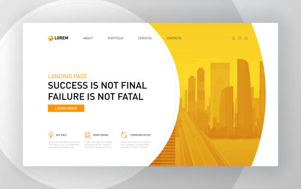
Clear and Concise Headline – The headline is one of the most important pieces of content on your website’s homepage. It should be clear and concise, and it should accurately reflect what your website is about. If your headline is confusing or misleading, people will likely leave your site without ever getting to know what you do.
Keep it short and sweet, between six and twelve words. And make sure it’s relevant to your website’s overall message.
What not to put in your headline? Avoid using jargon or buzzwords that people might not understand. You want everyone who visits your site to know exactly what you do, so keep it simple and straightforward.
Subheadings – Once you have a great headline, use subheadings to elaborate on what your website is about. Subheadings are usually shorter than headlines, between two and four words. They should be easy to read and provide additional information about your website’s content.
Avoid using too many subheadings on your homepage – one or two should suffice. And like your headline, make sure your subheadings are relevant to your website’s overall message.
Body Copy – The body copy is the meat of your homepage’s content. It should be clear and concise, and it should provide a detailed overview of what your website is all about. When writing the body copy for your homepage, think about what you want people to know about your site. What are its main features? What can users expect to find when they visit?
Answer these questions in your body copy, and be sure to keep it free from typos and grammar errors. Remember – first impressions matter! If your website’s home page has poor-quality content, people will likely leave without ever exploring further.
CTA (Call-to-Action) – A CTA is a short, actionable piece of content that tells users what to do next. It can be anything from “Sign up for our newsletter” to “Buy now. Your website’s homepage should have at least one CTA, and it should be placed in a prominent location where users will see it. The CTA should be relevant to your website’s overall message, and it should be clear and concise. You can put it under your Heading and subheading. Make sure that your CTA makes sense and is visible to the users.
What makes you different from all the other web designers/developers out there? Why should someone hire you over someone else? This is what’s known as your unique selling proposition (USP), and it’s an incredibly important part of any effective marketing strategy. If you don’t have a USP, now is the time to create one.
A quick overview of the services you offer is also a good idea for your website’s homepage. Again, you don’t want to get too bogged down in the details here – just give people a general sense of what you do and what they can expect when they work with you.
A website is not complete without including at least one testimonial from a past or current client. This helps to build your credibility and can be the deciding factor for someone who is on the fence about working with you. If you don’t have any testimonials, now is the time to start asking for them!
Finally, make sure that your contact information is prominently displayed on your website’s homepage. If someone wants to get in touch with you, they should be able to do so easily and without having to search around for your email address or phone number.

Now that we have mentioned some of the key points that should be included on your website’s homepage, let’s talk about what shouldn’t be there. A common mistake made by many web designers is putting too much information on the homepage. This can overwhelm visitors and make it difficult for them to find what they are looking for. Another thing to avoid is using a lot of images or videos. While they may look nice, they can slow down your website and make it more difficult to navigate. Finally, you want to make sure that your contact information is easy to find and up-to-date. Nothing is worse than losing a potential customer because they couldn’t get in touch with you!
If you keep these things in mind, you will be well on your way to creating an effective website that will help you reach your business goals. By following these simple tips, you can ensure that your website’s homepage is working for you and not against you. A well-designed website is a powerful marketing tool that can help you attract new customers and grow your business. So, make sure to put some thought into what goes on your homepage and you’ll be sure to see success in no time!

It’s no secret that owning a multi-service app like Gojek is becoming increasingly popular. With its awesome services and customer-centric […]
May 29, 2023

In the realm of web design, user interaction is a pivotal factor that determines the success of a website. Websites […]
Aug 14, 2023

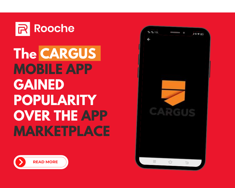
The Cargus Mobile App gained popularity over the App Marketplace with over 300,000 downloads. Furthermore the mobile app monthly sales […]
Dec 8, 2022
Join our newsletter and be the first to receive future promo and sale updates from Rooche!