5 Common Web Design Mistakes You Should Avoid
Many companies struggle to create new business ideas that encourage conversions and generate sales. A website is one of their […]
Dec 8, 2022
Dec 8, 2022

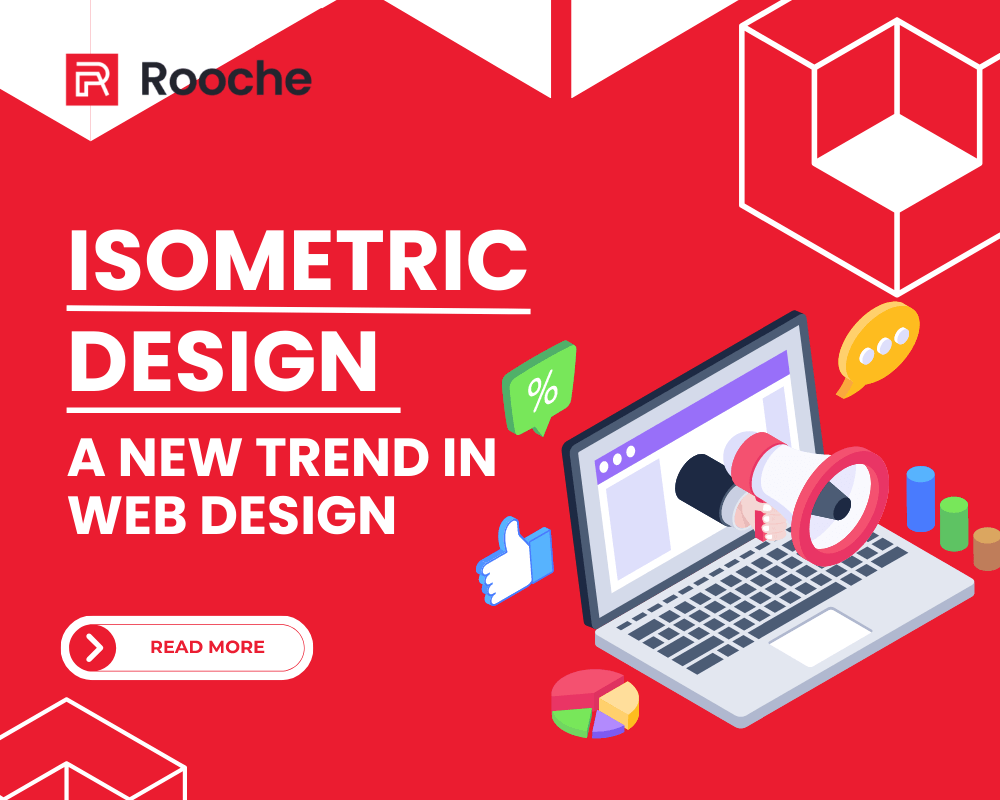
When you think of isometric design, you might think of the flat 3D designs you’ve seen in video games or on websites. These designs can add a lot of depth to your work and make your project look super high-tech. You can achieve these effects using some effortless tools. So don’t worry if you’re new to isometric design—this is a great place to start!
Isometric designs are flat and mimic three-dimensional objects. They are usually made from equilateral triangles, which means all sides are equal in length. Isometric design is a great way to add flair to your next project.
Isometric designs have many benefits on your website. They’re trendy, they make your site look clean and professional, and they can help you save space on your website. If you’re in the business of web design, you know that there are many different styles to choose from when you’re putting together a site.
They look great on all devices and pop no matter what screen your user is browsing on. They also allow for a lot of creativity, but without ever compromising your site’s overall style and feel.

Isometric designs are not only fun to look at but also make you feel like you’ve stepped through a portal into a futuristic otherworld. Because they’re so visually compelling, isometric designs tend to get more traffic than traditional flat designs. Isometric designs tend to be more memorable. It means visitors will be more likely to bookmark your site or save you in their browser.
These types of designs can help you create a visually appealing web design for your website that draws in your target audience. They can also be used to create a unique brand identity.
The design itself is 3D, but it’s often viewed in 2D, which means that isometric designs can get away with things that other design firms can’t. For example, with an isometric layout, clients can see the front and side of an object simultaneously. This makes it easier for them to envision what it would be like if they had the thing in hand, which increases their likelihood of purchasing from you.
Isometric designs are better at conveying a sense of space and scale
than flat designs, because they represent the illusion of perspective. You can achieve the three-dimensional or 3D effect by using lines and shading to create an image that looks like it has depth. Isometric designs can also give the illusion that an object has some weight due to its 3D appearance. This can make them useful for designing games or other graphics that require physical objects with mass.
They’re easy to understand, even at small sizes, and they allow you to use space more efficiently than traditional layouts. This means you can show more information in less area, which is great for websites where space is limited (like on mobile devices).
When used correctly, isometric designs are great for attracting attention to important information on your site. You can use an isometric design to draw attention to the information you want to disseminate for example, if you have an important announcement about your company, or if you want to promote a new product or feature. This is especially helpful if you have multiple announcements that need to be seen by visitors.
The isometric design will add a modern look to your site and lift your business above your competitors. Isometrics are also great because they work in harmony with responsive website design features: no matter how big or small your device screen gets, the shapes will stay intact without warping or skewing. So if you’re looking for a way to lift your website above the competition, consider using an isometric design!
Use an isometric design on your website to stand out from competitors and show off the latest trends. If you need help with this, Book us a Call!. We’ll work with you to create a website design that best suits your business and helps you stand out from competitors.

Many companies struggle to create new business ideas that encourage conversions and generate sales. A website is one of their […]
Dec 8, 2022

Gone are the days of having to brave long lines in stores or going out to eat at a restaurant […]
Jun 7, 2023

What is Figma? Figma is a collaborative interface design tool that makes working with your team, from brainstorming through final […]
Dec 8, 2022
Join our newsletter and be the first to receive future promo and sale updates from Rooche!